Here’s what Amazon’s new app logo teaches about UX and marketing
Recently Amazon caused a stir by changing its app logo. The e-commerce giant made headlines with its new logo and had to change it immediately after. This fiasco was full of learnings. Not just for Amazon but also for UX and marketing professionals. This guide will help you understand why Amazon had to change its new app logo immediately after its launch and delve into key insights that can be taken away from the ordeal.
What's the story behind the Amazon logo change?
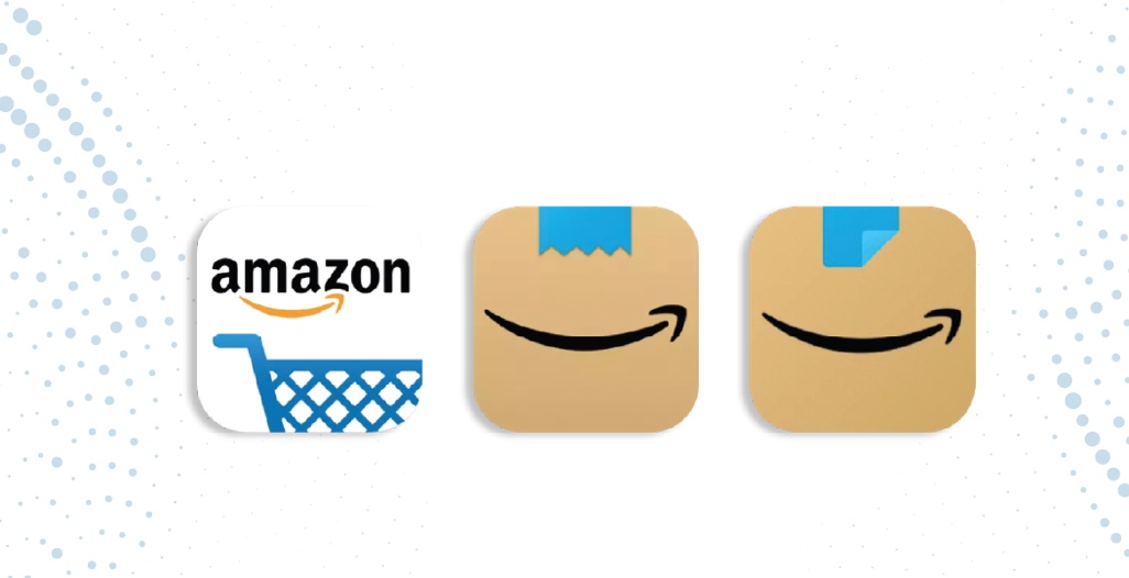
Before we delve into the lessons learned from the incident, let's understand what happened. To start off, Amazon launched a new logo for its mobile app. This logo symbolized the joy of receiving an Amazon parcel by showcasing a side shot of a blue tapped cardboard box with Amazon's signature arrow.
Unfortunately, after Amazon subtly rolled out this logo, several users, especially people on Twitter quickly noticed that the zig-zag blue tape on the logo resembled Hitler's moustache. Therefore, the new logo was linked to Hitler's smile.
Within a week after it was quietly launched, Amazon quietly made changes to it and released an altered version of its mobile app logo.
There are numerous takeaways from this fiasco. The top of which include:
1. Always A/B test
Better understanding One of the key mistakes Amazon made was to not properly A/B test its new logo. Had they done it, they would have gained insight into the perspective that made them change early on and finalize a different design.
2. A minor design change can affect brand identity
A logo may seem like another item on the list of design a brand needs. However, this incident showcased how important it truly can be. Now, Amazon's app logo will always be associated with Amazon's blunder. This has negative implications for the brand's identity.
3.Making a design change? Roll it out in phases!
Along with receiving flak for resembling a dictator's moustache, Twitter users also pointed out how senior citizens and the elderly were having trouble spotting the new logo on their phones. As a result, Amazon probably lost possible sales.
Those were our top takeaways from the Amazon logo change story. Want to avoid making any such design mistakes and get the best for your brand? We can help with that! At Rainmaker Infotech, we take every aspect of design from the logo to the placement of an icon seriously and study how each element of a design can affect a user's experience. To know more about us, click here.